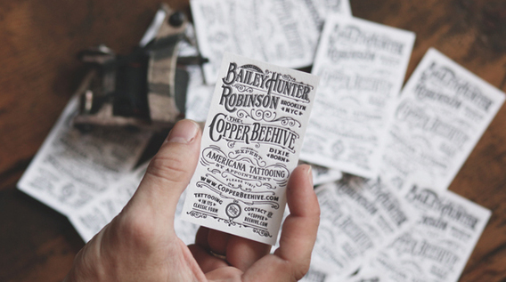
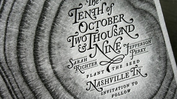
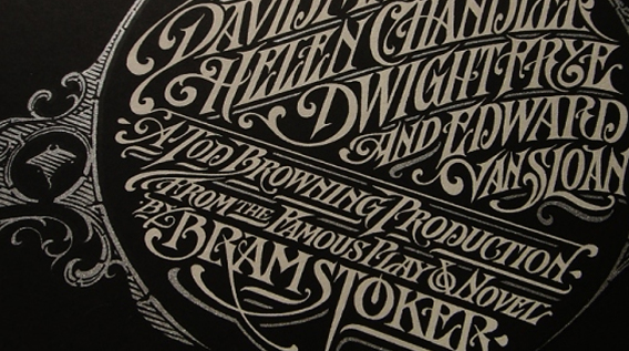
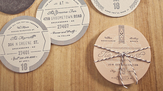
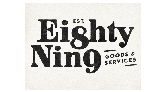
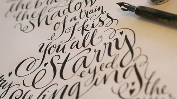
There is a place for the straight cut of the Sans Serif, but something about the smooth curves of the script and the sharp edges of the serif, harken back to a classic time in print history. A time that many designers find themselves replicating with their modern tools of trade: